Hi Ed,
Regarding the Desktop UI:
The design for the Navigation Widget from the earlier mail certainly looks good however I feel it somehow doesn’t integrate with the existing widgets so well. So with a view to unite the designs for the Playback Widget and the Navigation Widget, I have implemented some mock-ups which I have attached as a pdf with this mail. It is just a concept drawing and would undergo any necessary improvements required.
Regarding the Mobile UI:
As also mentioned in the previous mail, the above design for the Navigation Widget consumes a lot of space and would be troublesome to be used on a cellphone however it may be feasible on a tablet.
In order to improve the usability of Cesium on cellphones, one of the possible options can be:
To implement the following control buttons. The touch action will get the control of the active button (default would be PAN). This will definitely save a lot of space for the actual content and be simple enough for the users to understand.
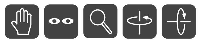
PAN LOOK ZOOM ROTATE TILT
The above PAN and LOOK buttons can also be provided on the Desktop.
The left click will get the control of the active button hence this may solve the problem of providing a seperate LOOK widget or even separate “modes” on UI.
Cheers,
Ravi
Widget Designs.pdf (163 KB)
I haven’t been following this entire discussion, but as far as mobile goes, touch controls seem to have become fairly ubiquitous. Is there a need for a navigation widget at all on touch-based platforms? I don’t think any of the big apps (Google Earth, Apple Maps, etc…) have anything but touch gestures (though I could be wrong).
Hi Ravi,
I’m liking these new designs a lot. I’ll throw this question to the whole list: Do you prefer these “flat” style designs over the complex gradients that we have on the animation widget now?
It seems that Win 8 and iOS 7 are leading the transition to flat style over fancy gradients, and I’ll admit I haven’t been on board with that yet, but I have an additional motive here: The gradients require SVG “defs” and have been a painful source of bugs and broken implementations (particularly in Blobs, where I’ve filed bugs against Chromium and Gecko). Switching to a flat design could solve a lot of problems here. It might be possible to get rid of the element entirely, for example.
I do think the flat-style widgets need a thin border, to make them stand out even if the background is the same shade of gray. Also it might be nice to have the gray be a tiny bit translucent.
Matt, it’s true that small screens shouldn’t show large nav widgets all the time, but there are reasons why users would want to display them on demand. Ravi suggested using a row of 5 buttons instead of the full widgets in this case, but I’d prefer not to have a separate set of controls like that. I’m thinking some other action, such as a long-press on the canvas, or a special button somewhere, should reveal the full nav widgets temporarily (until they become unused after a timeout, or after another touch of the reveal button). In other words, make them available when needed, but easy to dismiss. Would desktop users want that functionality as well?
–Ed.
Hi Matt,
I agree with you on this. The touch gestures have become commonplace and most of the big apps only use those. But most of the people must be familiar with only “Touch to Pan”, “Pinch to Zoom” and “Pinch Twist to Rotate” gestures as they are the only ones present in those big apps. Thus we are left out with two controls i.e. “Look” and “Tilt” which the users wont be able to get straightaway. Hence the need for some kind of a widget.
I hope I am making some sense. 
Ravi